


<script>
document.addEventListener("DOMContentLoaded", function() {
const style = document.createElement("style");
style.innerHTML = `
@media (max-width: 768px) {
.mobile-menu {
opacity: 0;
transform: translateY(-10px);
transition: opacity 0.35s ease, transform 0.35s ease;
pointer-events: none;
}
opacity: 1;
transform: translateY(0);
pointer-events: all;
}
}
@media (max-width: 768px) {
.smk-header {
flex-direction: row !important;
align-items: center !important;
justify-content: space-between !important;
padding: 6px 20px;
}
.menu-container {
display: flex !important;
flex-direction: row !important;
align-items: center;
justify-content: space-between;
width: 100%;
}
.menu-container .logo {
margin-right: auto;
}
.menu-container .menu-toggle {
display: block !important;
margin-left: auto;
font-size: 28px;
color: #083c5a;
padding: 8px;
}
.smk-header.menu-open
.smk-header.menu-open .menu-container .menu-toggle {
display: none !important;
}
.smk-header.menu-open .mobile-menu {
display: flex !important;
flex-direction: column;
position: absolute;
top: calc(100% - 1px);
right: 12px;
background-color: #f5f3e5;
border-radius: 12px;
box-shadow: 0 6px 20px rgba(0,0,0,0.12);
padding: 10px 20px;
z-index: 10000;
}
.smk-header.menu-open .mobile-menu a {
text-align: center;
border-bottom: 1px solid #ddd;
}
.smk-header.menu-open .mobile-menu a:last-child {
border-bottom: none;
}
}
/* Menú hamburguesa centrado debajo del logo cuando está activo */
@media (max-width: 768px) {
.smk-header.menu-open .mobile-menu {
align-items: center;
background-color: #f5f3e5;
border-radius: 12px;
padding: 10px 0;
box-shadow: 0 4px 12px rgba(0,0,0,0.08);
}
.smk-header.menu-open .mobile-menu a {
width: 100%;
text-align: center;
border-bottom: 1px solid #ddd;
}
.smk-header.menu-open .mobile-menu a:last-child {
border-bottom: none;
}
}
.mobile-menu {
display: none;
flex-direction: column;
background-color: transparent;
padding: 10px 0 0 0;
}
.mobile-menu a {
padding: 8px 16px;
font-weight: 600;
text-decoration: none;
color: #083c5a;
}
display: flex;
}
.menu-toggle {
display: none;
cursor: pointer;
font-size: 28px;
color: #083c5a;
margin-left: auto;
padding: 8px;
}
.menu-container {
display: flex;
width: 100%;
justify-content: space-between;
align-items: center;
}
@media (max-width: 768px) {
.smk-header {
flex-direction: column;
padding: 4px 20px;
align-items: flex-start;
}
.menu-container {
width: 100%;
justify-content: space-between;
align-items: center;
}
.smk-header nav {
display: none;
}
.menu-toggle {
display: block;
}
.smk-header .logo img {
height: 90px;
}
.smk-header .per-icon {
display: none;
}
body { margin: 0; padding: 0; }
}
.fade-in-body-wrapper {
opacity: 0;
transform: translateY(-20px);
animation: fadeInBody 1s ease-out forwards;
}
@keyframes fadeInBody {
to {
opacity: 1;
transform: translateY(0);
}
}
.fade-in-body { margin: 0; padding: 0; }
@keyframes fadeInBody {
to {
opacity: 1;
transform: translateY(0);
}
}
.fade-in-header {
opacity: 0;
transform: translateY(-15px);
animation: fadeInHeader 0.8s ease-out forwards;
}
@keyframes fadeInHeader {
to {
opacity: 1;
transform: translateY(0);
}
}
.smk-header {
position: fixed;
top: 0;
left: 0;
right: 0;
z-index: 9999;
display: flex;
justify-content: space-between;
align-items: center;
padding: 2px 40px 0;
background-color: #f5f3e5;
font-family: 'Segoe UI', sans-serif;
box-shadow: 0 2px 5px rgba(0,0,0,0.1);
}
body { margin: 0; padding: 0; }
.smk-header .logo img {
height: 120px;
transition: transform 0.3s ease;
}
.smk-header .logo img:hover {
transform: translateY(-4px);
}
.smk-header nav {
display: flex;
gap: 28px;
align-items: center;
font-size: 16px;
}
.smk-header nav a {
color: #083c5a;
text-decoration: none;
font-weight: 600;
transition: transform 0.3s ease, color 0.3s ease;
}
.smk-header nav a:hover {
transform: translateY(-2px);
color: #25d366;
}
.smk-header .per-icon {
display: inline-block;
vertical-align: middle;
margin-left: 12px;
transition: transform 0.3s ease;
}
.smk-header .per-icon img {
height: 78px;
transition: transform 0.3s ease;
}
.smk-header .per-icon:hover img {
transform: translateY(-4px);
}
.menu-toggle {
display: none;
cursor: pointer;
font-size: 28px;
margin-left: auto;
color: #083c5a;
}
.mobile-menu {
display: none;
flex-direction: column;
background-color: #f5f3e5;
padding: 10px 20px;
border-radius: 12px;
box-shadow: 0 4px 12px rgba(0,0,0,0.1);
}
.mobile-menu a {
padding: 10px 0;
border-bottom: 1px solid #ddd;
color: #083c5a;
font-weight: 600;
text-decoration: none;
}
.mobile-menu a:last-child {
border-bottom: none;
}
@media (max-width: 768px) {
.smk-header {
flex-direction: row;
padding: 6px 20px;
}
.smk-header nav {
display: none;
}
.menu-toggle {
display: block;
}
.smk-header .logo img {
height: 90px;
}
.smk-header .per-icon {
display: none;
}
display: flex;
}
body { margin: 0; padding: 0; }
}
`;
document.head.appendChild(style);
const header = document.createElement("header");
header.className = "smk-header";
header.innerHTML = `
</div>
<div class="menu-container">
<div class="logo">
<a href='https://smkempaques.com.mx'>
<img src='https://dmtei.com/smk/logo.png' alt='SMK Logo'>
</a>
</div>
<div class="menu-toggle">☰</div>
<nav>
<a href='https://smkempaques.com.mx'>Home</a> |
<a href='#'>About Us</a> |
<a href='#'>Books</a> |
<a href='https://smkempaques.com.mx/services'>Services</a> |
<a href='#'>Blog</a> |
<a href='#'>Contact</a> |
<a href='https://app.smkempaques.com.mx' class='per-icon'>
<img src='https://dmtei.com/smk/PER.png' alt='PER'>
</a>
</nav>
</div>
<div class="mobile-menu" id="mobileMenu">
<a href='https://smkempaques.com.mx'>Home</a>
<a href='#'>About Us</a>
<a href='#'>Books</a>
<a href='https://smkempaques.com.mx/services'>Services</a>
<a href='#'>Blog</a>
<a href='#'>Contact</a>
<a href='https://app.smkempaques.com.mx'><img src='https://dmtei.com/smk/PER.png' alt='PER' style='height: 60px; display: block; margin: 10px auto;'></a>
</div>
`;
header.classList.add("fade-in-header");
header.classList.add("fade-in-header");
document.body.insertBefore(header, document.body.firstChild);
const wrapper = document.createElement("div");
wrapper.className = "fade-in-body-wrapper";
while (document.body.children.length > 1) {
wrapper.appendChild(document.body.children[1]);
}
document.body.appendChild(wrapper);
document.querySelectorAll(".menu-toggle").forEach(button => {
button.addEventListener("click", function() {
const header = document.querySelector(".smk-header");
document.getElementById("mobileMenu").classList.toggle("show");
header.classList.toggle("menu-open");
});
});
});
</script>


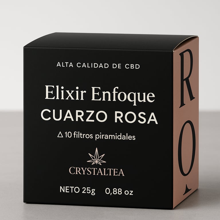
Explora nuestras cajas personalizadas para cada necesidad y ocasión.


¡Estate atento a nuestros nuevos lanzamientos!
PROYECTA UNA IMAGEN PROFESIONAL EN TU MARCA